If you’re in marketing and branding, you want your brand to stand out and capture your target’s attention. But so often, brands will look, sound and act like the rest of their competition. In order to stand out, you’ve got to break from your category’s convention and look, sound and act utterly distinctive so that you become memorable from the rest. How do you do that?

First – What is category convention? 

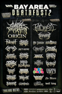
Here’s a great example. If you’re a heavy metal fan and were in San Francisco in 2015 you probably would’ve seen this poster plastered all over town:


Von Restorff Effect and Category Convention

The Von Restorff Effect and Category Convention

And if you’re like 99.8% of the people out there, your eyes would have automatically gravitated to one particular band. 

No slight to the other talented bands on this poster, but this is an excellent example of Category Convention. To understand its power, we need to first understand the Von Restorff Effect, also known as ‘the isolation effect,’ which was codified in 1934 by German psychologist Hedwig von Restorff (1906–1962), who found that when participants were presented with a list of categorically similar items with one distinctive, isolated item on the list, they recalled the one distinctive item the most.

For example, if a person sees a shopping list with one item highlighted in bright green, s/he will be more likely to remember the highlighted item than any of the others. Or, given a list of words – desk, chair, bed, table, chipmunk, dresser, stool, couch – “chipmunk” will be remembered the most, as it stands out against the other words in its meaning.

In other words: if you want to be memorable you’ve got to stand out.

But let’s get back to heavy metal and Category Convention. As I mentioned, if you’re like most people out there, you would’ve noticed one particular band: Party Cannon. That’s because its logo is bright and colorful and a direct contrast to the spidery gothic script that the other heavy metal bands used. In fact, I’d be willing to assume that you noticed no other band except for Party Cannon. Wouldn’t you want that kind of impact for your business?

That’s why it’s super important to make sure your business stands out in every possible way, to capture people’s attention and stay in their memory.

So how do you do that?

Discover Your Category’s Convention

The first thing you need to do is discover your category convention. You’ll want to spend some time looking at your category critically. Who are all the players? What language do your competitors use? What about dominant colors? How do they talk about themselves – what tone do they use? Are they light and personable, or formal? Let’s bring this to light with an example.

One of our clients is in the tax & accounting sector. When we looked at the category convention for the accounting sector, here’s what we found:

Tax and accounting category convention

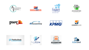
Tax and accounting logo category convention


We saw a lot of spreadsheets, boxes, checkmarks and arrows in their logos.

In terms of names, the vast majority of them had surnames as their business names, like “Thompson & Greenspon” or “The Goldin Group.” PWC and KPMG all stand for the original partners’ surnames.


Category convention colors

Category convention colors


In terms of colors, we saw a lot of blue, reds and oranges. Arrows, boxes, check marks. Good to know.

We made a note of all the category convention cues and listed them as everything we wanted to avoid.


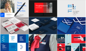
When it came time to design the brand, we knew exactly how to create differentiation. We recommended a name that created a warm association (our client stayed with her original name, Monarch CPA, which we loved because it was distinctive), and recommended dark green and coral colors (to cue financial prosperity and vitality, while also avoiding the category convention) and a logo – an elephant, emblematic of a monarch, one that is intelligent and majestic. Visually these cues were wildly different from the competition.


Breaking the accounting category convention

Breaking the accounting category convention

warm, differentiated, approachable

warm, differentiated, approachable


Category Convention in Communications

We also looked at language. For most of the competition, they spoke in 3rd person and had a formality to their communications. We opted to go more direct and casual, speaking to her audience in the 2nd person, and in an approachable, friendly manner. We avoided the dreadfully dry and verbose accounting speak. In doing so, we helped her business stand out from the competition and signal a very different look and feel. She was thrilled with her rebrand experience and the differentiation we created for her. You can explore the website more fully here.

Go Beyond Your Category Convention

DIYers: when turning to your own business, you’ll want to do this exercise thoroughly. Begin by exploring how your competition communicates visually and verbally. Make a note of tone of voice, brand personality and archetypes, color and even font selection. Dig deep and look at all facets of communications: from company name to logo, colors, font, copy, images, everything. Then draft up your notes. Work with a talented design team who can help you pivot off your category convention into a white space that feels distinctively different and right for your brand.

Need help? Give us a shout. We regularly help our clients stand out from the competition with great success.  We work to uncover the category convention for all our clients, a standard part of our process and we’d love to help your business stand out and make you magnetic to success, too.

As a business owner, you’re always stretched in a million different directions. You don’t often think about your logo and if it’s conveying the right message about your business. But is it helping you leave your mark?

Details matter. Your logo can help attract new customers and  distinguish you from your competition. Since it’s my business to help growing businesses grow magnetic brands, I spend a lot of time working with clients to ensure their logo, fonts and color schemes are telling their full brand story in a simple but compelling way. If you’ve ever wondered what makes for a great logo, if you’re considering designing one for your business, or if your current one makes you cringe: below are some helpful logo design tips to keep in mind.

First: do you even need a logo?

Many small businesses decide to skip the logo in the very beginning, or they get something simple off 99designs.com. Either route is great, especially when starting out. But as your business evolves, remember that we live in a world of symbols, so whatever’s next to your company name is functioning as your de facto logo. So let’s ask this a different way: what’s the point of a logo? And does your current one work to your advantage? Here are some benefits that a logo provides:

  1. A logo tells people the name of your company.
  2. It creates differentiation and a good one makes your brand stand out.
  3. A logo represents your business. A great logo has a symbolic association, making your company instantly more memorable and more endearing.
  4. It invites people to explore your brand. Symbols and colors are more interesting to the human eye and mind than plain text. Logos draw interest and pique the curiosity of your potential customers, prompting them to discover more about your product or service.
  5. It can go everywhere. Website, business cards, office door, letterhead: a logo is a visual representation of your business and can extend your brand  everywhere. With a logo, you have more opportunity to be top of mind for your customers and prospects. And familiarity breeds preference.

Now let’s go back to your current logo. If it’s delivering on all these points, then that’s a win for you.
But if you feel that your current logo isn’t working for you, and you want to make your brand clearer and more inviting, then let’s talk about what you should look for in logo design.

The Role of Color, Shape & Font

  • Color. Color psychology goes back as far as the ancient Egyptians; they figured out color can impact mood and human behavior. Today, color is important in our media-frenzied society because it can help draw attention to your brand and make it stand out. And research has shown that 60% of customers’ product choices are impacted by color alone.

    So what’s the right color for your brand? Well, that depends on what you want to convey.  For instance, blue conjures up feelings of calmness, confidence and honesty, while red is the opposite: it conveys passion, intensity and excitement. Yellow symbolizes positivity and optimism, while green conveys freshness, prosperity and nature. There are thousands of color options, so it’s important to first figure out what qualities and values you want to express and then apply that to your brand. For some color psychology basics, this color psychology explanation conveys the power of color that brands might want to consider. 
  • Shape. Our subconscious mind responds to shapes and associates attributes with them, so designers factor in shape when designing logos. For example: are you wanting to convey community, unity, a sense of belonging? Then your logo would most likely be circular or oval shaped. If you’re wanting to express stability, strength and professionalism: squares. A sense of power, science, logic? Triangles. Below are a few examples of global brands that have been using shapes to subliminally suggest brand values; it can work for your company as well.

Pepsi communicates community and unity; Microsoft expresses stability and strength; Google Drive projects technology prowess and logic.

  • Font. It’s not just words on a page. Typefaces have distinct personalities – did you know? The latest research suggests that typefaces convey their own meanings and elicit specific emotional responses independent based on the forms of the letters and words on the page or screen. Serif types are focused and calming; rounder types elicit happiness; sharper types, anger. If you want to convey tradition and respect, a classic serif font like Times New Roman is right for you. Are you innovative? Then consider a cleaner and modern font, a non-serif like Futura or Helvetica.  Is your brand creative or elegant? A cursive font could help deliver that message. Or perhaps your brand is playful and creative – then you might want to lean in to a display style, like Valencia or Cooper.

A Word on Simplicity

Given all the things we want our logo to say and represent – not to mention that some logos can cost a lot of money – the tendency is to make sure they serve up a whole slew of brand message. But that makes them complicated, which is exactly the inverse of what you want. The most revered logos in the world are actually breathtakingly simple.


This doesn’t mean they’re simple to create. Reducing an idea down to an elemental symbol that captures one overarching big idea – that encapsulates other elements – is often the toughest part of the logo design process. Many logos, even those of big and successful companies, fail to stand out or be memorable because they can’t easily be associated with a single idea. Sometimes that’s because they’re too complex, and sometimes because they’re too abstract. 

Secondly, you should love your logo, but your customers are the best judge, since it’s largely for them. Try to see your logo from their perspective. Thirdly, it’s cool to have hidden messages in your logo’s design, but if it’s not conveying the point of your brand to your customers, you’ve overshot the mark. If you have a few customers you trust and are close to, ask them for their thoughts on your logo. Does it convey the points you were hoping to get across?

If you’re considering hiring a graphic designer to update your brand look and feel, it’s helpful to speak with someone who can help you hit these points design-wise. Additionally, you want a designer who can convey the bigger picture of what your business  stands for, while remaining dedicated to simplicity. If you’ve worked with designer in the past and like their work and feel your logo could use an update, talk with them about how to make your logo more impactful.

Need a designer to give your brand a new look? We’d would be happy to have a conversation about logos and more. At Magnetic Brand Strategy, we have a team of dedicated creative designers who can expertly shape simple and powerful logos. We’re dedicated to helping small and growing businesses become magnetic to the people who matter to them.